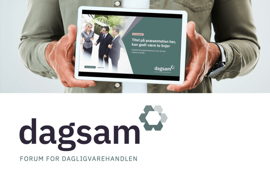
Skip to content

Identity design

Lottom

Brand concept and identity proposals for an online lottery portal for presenting the biggest games around the world. Brand communication focuses on the idea that the portal’s high usability and many services provide users a partnership that optimises each visitor’s chances of winning.

Gavary shoes

Development of a shoe brand concept aimed at Russian and East European markets. Based on a brand proposition targeting sophisticated urban audiences, but with a sport/leisure slant, our studio designed examples of visual identity, including logo, slogans, packaging, ads, point-of-sales material, etc as well as consultation on building up the new brand.

Rabagast

Identity for Rabagast Film, a Scandinavian film and advertising production company. The identity was to project both a certain Scandinavian cool and the dramatically spectacular. The Ring of Fire signature relates to the often daunting, but ultimately rewarding process of shooting films and adverts. Services; Identity concept, logo design, print design, desktop publishing, web concept, project management.

CAN

Crew Advantage Network connects yacht captains and their crew with the best local services and establishments in their favorite port destinations. We developed a maritime inspired identity as well as promotional material for CAN.

Ibiza Gran Hotel

Spanish artist and design icon Oscar Marine and munch|strøm collaborated on an identity for the five star contemporary luxury hotel built on Ibiza. We designed all communication material needed to get the hotel up and running on time and in line with the developed concept, which also required carefully prepared manuals and production guides.

Daypower

The brand name, the colourful style of the visual identity, and the downsizing packaging strategies places DAYPOWER oatmeal products within the means of low-income populations in developing countries, the DAYPOWER Oatmeal brand was made for entry into the informal trade across emerging markets in the Middle East, Asia and Africa.

Kioo Drinking Water Co.

KIOO is Swahili for ‘Crystal’. Employing the best Danish, German and South African technology this sustainable commercial drinking water producer is located next to one of the world’s fastest growing urban populations, namely Dar es Salaam in Tanzania. Naming, identity and packaging was developed by Munch & Strøm.

Schools for Health

A complete remake of the S·H·E identity, style and look of both online and printed material. Apart from creating an identity we assured that it’s implementation in the organization went as easy as possible by facilitating design manuals, tools and templates.
Biggest challenge however was converting their existing web portal into a new modern one without loosing content. Every year we also make an animated video promoting and explaining the organizations work.